
01 / Background
Background
Sending weekly bulletins about changes to Epic was a significant part of my work at Denver Health. Doctors, in general, do not want to read emails—and software updates ranged from consequential workflow changes to details that were genuinely banal.
I could not promise riveting content in every message, but I could make sure there was always something interesting to look at.
02 / Purpose
Purpose
The immediate purpose was practical: give clinicians a reason to notice a recurring communication that might occasionally contain something important. The broader opportunity was to continue making hospital communication clear but unique and engaging, rather than accepting that institutional material had to be visually dead. On a more philosophical level, my job was to communicate with people who worked incredibly hard and bore profound responsibilities. Anything I asked them to do or look at had to be useful, enjoyable, meaningful, and well-crafted.
03 / Process
Process
The first bulletins were almost entirely text: useful, but easy to ignore. I began adding found photographs, chosen for an oblique or humorous relationship to each update. The work expanded into altered magazine advertisements, movie posters, album covers, and invented book covers. Familiar forms gave readers an immediate point of entry while the substitutions rewarded a closer look.
Eventually I began creating digital collages untethered to clear referents—neither satire nor homage. I stopped worrying about whether anyone could easily interpret them, but these pieces were also the most influenced by the hospital itself. Ambiguity, simultaneity, fragility, and the tension between pattern and chaos became recurring elements.
04 / Outcome
Outcome
The images gave the weekly updates a recognizable identity and earned attention in their original setting. Providers emailed to express their recognition of different references in the work, and the question 'Are you the guy who sends those emails?' started many warm conversations.
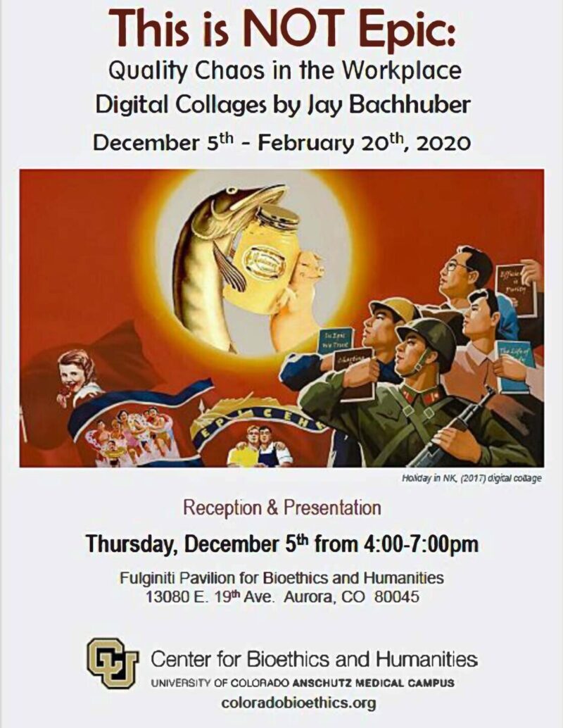
Eventually, a supportive doctor who also worked at University of Colorado's hospital asked if I'd be interested in exhibiting my work. He connected me with the curators of the Anschutz Center for Bioethics and Humanities, and from December 2019 through March 2020 I had my first solo art show. A print from the show still hangs in the Center's second-floor offices.
“I can’t actually love this enough.”
“Can I just say how much I enjoyed this email.”
“I like this new, quasi-funny but not full Onion middle-ground you’ve found with your updates.”
05 / Key Learnings
Key Learnings
Communication design can do its practical job without exhausting the ambiguity, humor, and visual intelligence that make people want to look. Repetition was not a reason to standardize the life out of the work; it created a structure within which an artistic practice could evolve.
The project also made visible a continuity across my work: institutional constraints, close observation of an audience, and play can produce artifacts that are both seriously functional and allowed to become strange.
I think of Denver Health as a place daily bursting with the full range of the human condition: countervailing entropy held together by the tireless labor of devoted staff. I made this work for those people, and doing so was a real privilege.